Making A Difference In Food Delivery
“My right arm doesn’t really work any more, so I can’t carry big things. It’s frustrating; I have to get help or have it delivered, and when a shopper messes up the order, I have to start all over again. I just don’t have the energy to deal with that.”
- Participant, KMR
Working as the only UX designer on this study, I was tasked with researching the usability of food ordering websites in order to understand pain points and create a more user-friendly site. Through that research, I identified a need in the market for a simplified ordering site, focused on easy and reliable food ordering and service-forward delivery for those with physical and age-related health restrictions. My design concept, Comfort Food, was directed by those findings.
Project Background

Process
Role
UX Designer
Date
January 2024

Methods
User Interviews
Directed Storytelling
Synthesis
Affinity Diagramming
Sketched Wireframes
Architectural Diagramming
Digital Wireframes
Usability Testing
Reporting
Tools
Figma
Figjam
Otter.ai
Zoom
Google Slides


Practices
User Research
UX Design
Prototyping

Make It Easy
Comfort Food: A Simplified Approach To Food Delivery


Website Concept
Food Delivery Website • New Concept • Comfort Food
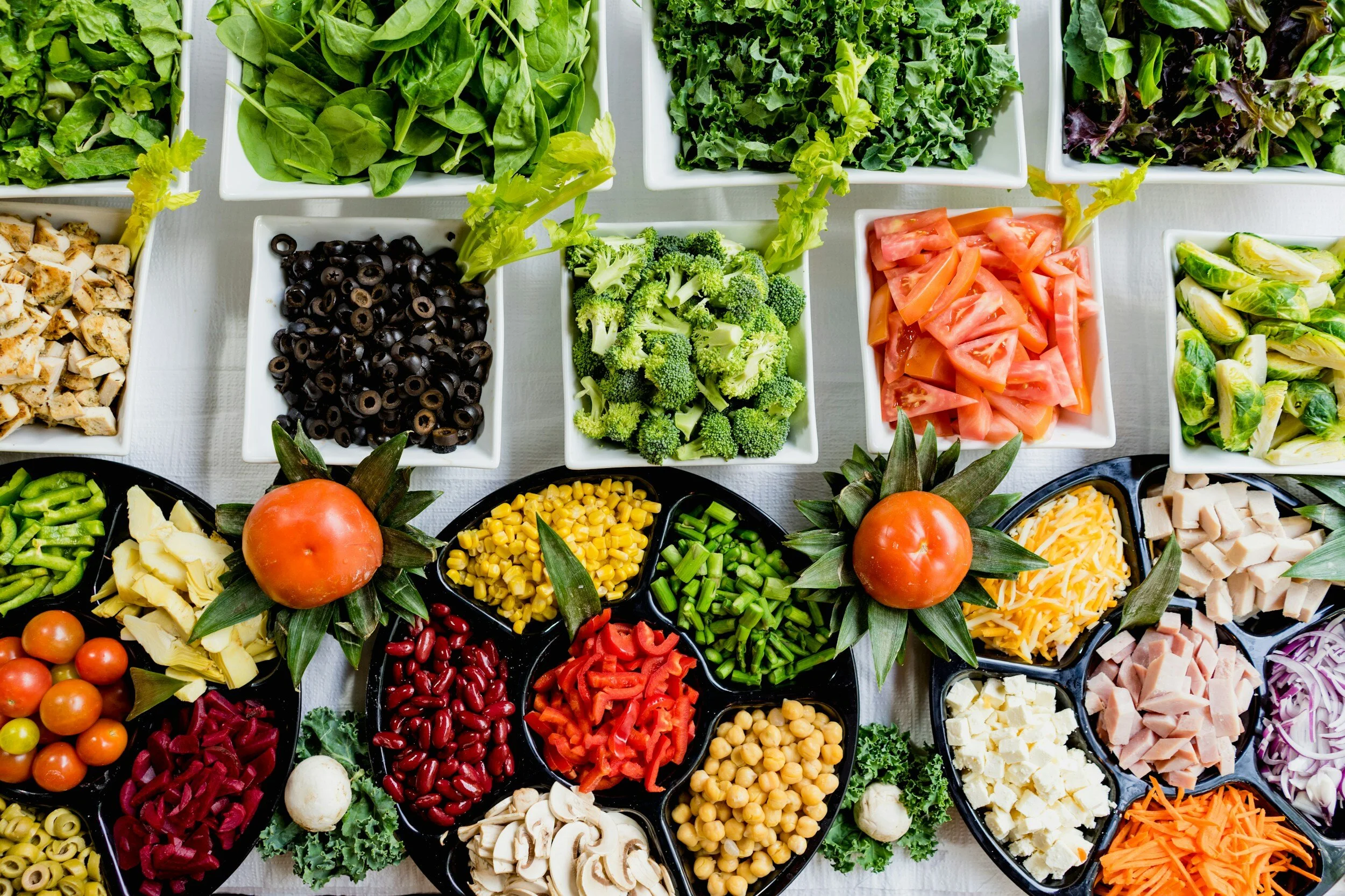
Comfort Food is a new concept website aiming to simplify the ordering and delivery process for users with physical or age-related health restrictions. The intent is that users feel less overwhelmed by too many options, or frustrated by ambiguous site pathways as they order groceries. The simplified site will allow for accessibility and ease for users who may be feeling vulnerable in other areas of their lives.
A Problem To Solve
The Case Study
As I conducted Directed Storytelling interviews with users of food delivery sites, a common theme emerged: 3/3 had chosen to use the sites during times of illness and injury. As I listened to their stories, I noted their frustration with using overly-complex websites and receiving incomplete or incorrect orders, especially at times when they didn’t feel well. With these users in mind, I developed my goal statement.
Goal Statement:
My user group is adults with a variety of health restrictions who need convenient, consistent, and economical delivery and pick-up options for high-quality grocery and household items. They would like to easily get what they need, when they need it, so they feel safe, supported, and cared for in their daily lives.
“I just needed it to be simple, because I was too tired to think.”
Participant, JMK
Identify - Understanding Users
My user group includes people who are in vulnerable stages of their lives. For example, one of my users has advanced cancer and her treatments leave her tired and weak with physical limitations. She wants to be able to order basic items for her family and know she can get what she needs, without a lot of extra stress and effort.
Another user recently had foot surgery and can't leave the house while she heals. She has a busy family and wants to be able to order what they need , but complicated websites and shopper errors add frustration and stress at a time when she feels the least equipped to handle it.
I also have a personal connection to the intended user group, as I have witnessed my elderly mother struggle to place orders on-line. If a site is overwhelming, she gives up, without placing the order at all. Other times, the sites are confusing and she makes mistakes: nine bags of Oreos once showed up at her door! She is frustrated when she is unable to fulfill her needs on her own.

uncomplicated and uncluttered pages with good visibility and functionality
intuitive and easy-to-follow site structure
large and easy-to-see buttons with high findability
limited product selections per page to increase visibility and simplify the ordering process
personalized shopping lists to easily edit and recreate previous orders
customizable delivery and personal shopper options to tailor services based on preference or physical needs


Prototype: Building Solutions
Because this website is for people with physical, mental, and emotional limitations, my solution was to create a site with…


Evaluate: Finding Balance
The Process
• creating a basic website prototype
• conducting usability testing
• synthesizing data from participants
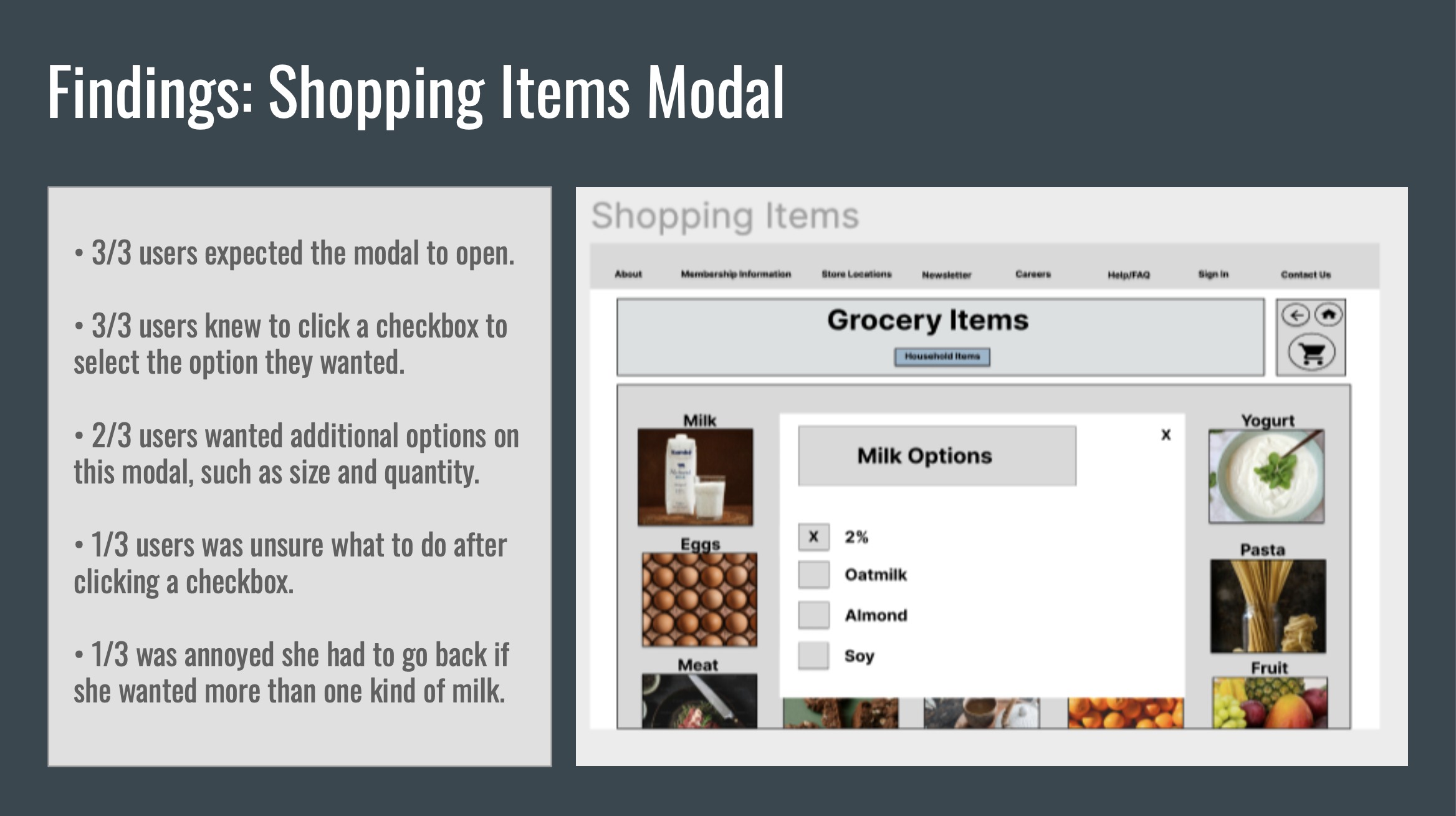
Usability testing revealed that the larger format of images, text, and buttons increased visibility and findability of key page functions, resulting in fewer mistakes: 3/3 users successfully completed ordering tasks. However, testing also revealed that the initial designs were too simple: 2/3 users weren’t able to order the exact items they wanted, and 2/3 users thought the site appeared too plain and boring. I summarized these findings in a usability report complete with proposed solutions to be implemented.


Next Steps
If I had the opportunity to continue working on this, future plans would include:
revisions to existing digital prototype
refining architecture by designing unfinished pages
additional usability testing with intended user group